

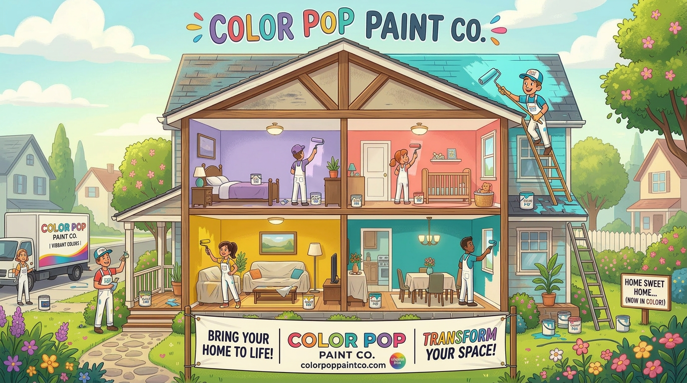
Leave the Headaches to the Pros: Why Hiring Color Pop Paint Co. Just Makes Sense
Leave the Headaches to the Pros: Why Hiring Color Pop Paint Co. Just Makes Sense
Let’s be honest—almost everyone thinks they can paint.
You watch a couple YouTube videos, grab a roller, crack open a gallon of paint, and think, “How hard can this be?”
Then reality hits.
Suddenly, it’s not just painting—it’s taping, prepping, patching, sanding, edging, cutting in, moving furniture, covering floors… and somehow, you’ve spent your entire Saturday and barely finished one wall.
It Always Takes Longer Than You Think
Painting is one of those projects that looks quick and easy—until you’re in the middle of it. What you thought would take a few hours turns into an entire weekend… then spills into the next.
And that’s assuming everything goes right.
Miss a spot? Go back and fix it.
Uneven coat? Do another.
Drips or roller marks? Now you’re reworking sections.
Wrong sheen or color? Start over.
Before you know it, your “simple project” has taken over your home—and your patience.
The Prep Work Alone Is a Job
Here’s what most people don’t realize: painting isn’t just about putting color on a wall. The real work is in the preparation.
Professionals know that a flawless finish starts long before the first coat goes on. That means:
Repairing dents, dings, and drywall imperfections
Sanding for smooth surfaces
Properly taping edges and trim
Priming where needed
Skip these steps, and it shows. Big time.
The Tools (and Skill) Matter
A professional paint job isn’t just about effort—it’s about technique.
At Color Pop Paint Co., we use the right tools, the right materials, and years of experience to get clean lines, smooth finishes, and long-lasting results. No streaks. No roller marks. No “good enough.”
Just a finish you’re proud to look at every single day.
Save Your Time (and Your Sanity)
Your time is valuable. Do you really want to spend your evenings and weekends wrestling with ladders, brushes, and drop cloths?
Or would you rather come home to a finished space that looks incredible—without lifting a finger?
Hiring a professional means:
No mess
No stress
No wasted weekends
No half-finished projects staring at you for weeks
And Let’s Be Real…
Let’s get that project off the honey-do list once and for all.
Because nothing drags on longer than a DIY paint job that never quite gets finished. Save yourself the tension, the frustration, and yes—even the gentle (or not-so-gentle) reminders.
The Color Pop Difference
At Color Pop Paint Co., we take pride in transforming homes quickly, cleanly, and professionally. Whether it’s a single room or a full exterior repaint, no job is too small—and every job gets the same attention to detail.
You get:
Professional results
Efficient turnaround
A home that truly pops
And your weekends back
Bottom line?
Painting looks easy—until you’re the one doing it.
Skip the headaches. Skip the hassle. Let Color Pop Paint Co. handle it right the first time.
Ready to check it off the list for good? Let’s get your project scheduled.

365 Days of Color Pop: Why Exterior Painting Beats Seasonal Landscaping
365 Days of Color Pop: Why Exterior Painting Beats Seasonal Landscaping
When spring arrives, many homeowners start thinking about freshening up the outside of their homes. New flowers, trimmed bushes, and fresh mulch can certainly make your yard look beautiful. Landscaping has its place—but the truth is, most landscaping only pops from spring through fall.
An exterior repaint, on the other hand, gives you something better: 365 days of Color Pop.
Color That Works All Year Long
Landscaping is seasonal. Flowers bloom, leaves fall, and winter often leaves yards looking bare and tired. But when your home’s exterior is freshly painted, that color and curb appeal are there every single day of the year.
Imagine pulling into your driveway on a snowy winter evening or a bright summer afternoon and seeing your home looking fresh, clean, and vibrant. That feeling doesn’t disappear when the seasons change. A professional exterior repaint keeps your home looking its best through every season in Utah.
Curb Appeal That Lasts
A quality exterior paint job doesn’t just make your house look good—it transforms your entire property.
Fresh paint can:
Modernize an older color scheme
Highlight architectural details
Increase perceived home value
Make your home stand out in the neighborhood
Many homeowners are surprised how dramatically a simple color refresh can change the entire feel of their home.
More Affordable Than Most People Think
One of the biggest misconceptions about exterior painting is the cost. Many homeowners assume a repaint is far more expensive than it actually is.
When you compare the value, exterior painting is often one of the most cost-effective upgrades you can make to your home. Unlike landscaping that requires new plants, mulch, watering systems, and constant upkeep, a professionally painted exterior can last 7–12 years depending on the materials and conditions.
That means you get years of enjoyment and protection from a single investment.
Protection for Your Home
Exterior paint does more than improve appearance—it also protects your home.
A quality paint system helps shield your siding from:
Moisture
Sun damage
Wind and weather
Wood rot and deterioration
In a climate like Utah’s—with strong sun, winter snow, and seasonal temperature swings—protecting your home’s exterior is extremely important.
The Feeling When You Pull Into the Driveway
There’s something powerful about coming home to a house that looks amazing. When the colors are fresh, the trim is crisp, and the entire exterior looks renewed, it changes how you feel about your home.
Homeowners often say the same thing after a repaint:
“It feels like a brand-new house.”
And that feeling doesn’t fade after the flowers die off in October. It’s there every time you pull into your driveway.
Bring the Color Pop Back to Your Home
At Color Pop Paint Co, we help homeowners throughout Utah County refresh, protect, and transform their homes with professional exterior painting.
If your home’s color has faded, feels dated, or simply doesn’t excite you anymore, an exterior repaint may be the upgrade that brings it back to life.
Because landscaping may pop for a season…
But Color Pop lasts all year.
Chris Plocinik

Spring Is Here — And No Painting Job Is Too Small
Spring Is Here — And No Painting Job Is Too Small
Color Pop Paint Co | Serving Payson and Surrounding Areas
As the snow melts and the days start getting longer here in Utah County, spring brings that familiar feeling — the urge to freshen things up. Windows get opened, yards get cleaned up, and many homeowners start noticing little painting projects around the house that could use some attention.
At Color Pop Paint Co, spring is one of our favorite times of year because it’s when small improvements can make a huge difference in how your home feels.
The best part? No job is too small.
Small Projects That Make a Big Impact
Many people think painters are only interested in full house repaints, but that’s simply not the case with Color Pop Paint Co. Sometimes the smallest projects can completely transform a space.
Spring is the perfect time for projects like:
Freshening up a front door to boost curb appeal
Painting a bathroom or powder room
Touching up trim, baseboards, or doors
Updating a bedroom with a new color
Fixing scuffs and wear from winter
Repainting a faded mailbox, shutters, or porch railings
Small exterior touch-ups before summer
A few hours of painting can make your home feel cleaner, brighter, and brand new again.
Interior or Exterior — We’ve Got You Covered
Spring weather makes it the perfect season to start thinking about both interior and exterior painting.
Inside the home, a fresh coat of paint can brighten rooms that felt dark all winter. Outside, touching up trim, siding, or doors helps protect your home while improving the overall look of your property.
Whether it's one room, one wall, or the whole house, Color Pop Paint Co treats every project with the same care and attention to detail.
Local Service You Can Trust
Color Pop Paint Co proudly serves Payson and surrounding communities throughout Utah County. Our goal is simple: deliver quality work, fair pricing, and make every customer feel like family.
We know inviting someone into your home is a big deal, and we take pride in doing the job right the first time.
Ready for a Spring Refresh?
If you've been looking around your home thinking, “That could really use a fresh coat of paint,” now is the perfect time.
And remember — no job is too small.
Whether it’s a quick touch-up, a front door that needs to pop, or a full repaint, Color Pop Paint Co is ready to help bring new life to your home this spring.
Contact Color Pop Paint Co today and let’s make your home Color Pop this spring.
March Into a Fresh Start with Color Pop Paint Co.
March is the month when everything starts waking up again. The days get longer, the weather begins to warm up, and many homeowners start thinking about the projects they’ve been putting off all winter. If your home’s paint is looking a little tired, March is the perfect time to plan your next interior or exterior repaint.
At Color Pop Paint Co., we proudly provide professional interior and exterior painting services in Payson and the surrounding communities. Whether you want to brighten up a room inside your home or completely refresh the exterior, our goal is simple: make your home stand out and feel brand new.
Interior Painting: Refresh Your Space for Spring
Winter means a lot of time spent indoors, which also means it’s easy to start noticing scuffs on the walls, outdated colors, or rooms that simply need a fresh look. A professional interior repaint can instantly transform your home.
Some popular March interior projects include:
Freshening up living rooms and hallways after a long winter
Updating kitchens with modern, lighter colors
Creating a bold accent wall to add personality
Repainting bathrooms and bedrooms for a clean, relaxing feel
A new color can completely change the mood of a room and give your home the fresh start that spring brings.
Exterior Painting: Get on the Schedule Early
March is also a smart time to plan your exterior repaint. While the warmest painting days are just around the corner, booking early ensures you secure a spot on the schedule once ideal painting weather arrives.
An exterior repaint can:
Boost curb appeal instantly
Protect siding and trim from weather damage
Increase the value of your home
Make your house stand out in the neighborhood
Even smaller projects—like painting your front door, shutters, trim, or garage door—can make a huge difference in how your home looks from the street.
Why Homeowners Choose Color Pop Paint Co.
At Color Pop Paint Co., we believe painting is about more than just applying color. It’s about helping homeowners fall in love with their homes again.
When you work with us, you can expect:
✔ Professional preparation and clean finishes
✔ Attention to detail on every project
✔ Friendly, reliable service
✔ Colors that truly pop
Ready to Bring Your Home to Life?
Spring is right around the corner, and there’s no better time to give your home the refresh it deserves. Whether you’re thinking about an interior repaint, exterior refresh, or small project that makes a big impact, Color Pop Paint Co. is here to help.
If you live in Payson or nearby areas, now is the perfect time to schedule your March painting project and get your home ready for the season ahead.
Because sometimes all it takes is the right color… to make your home Color Pop.
New Year. New Color. New Home
New Year. New Color. New Home
Is your home still wearing the color the builder chose? Or maybe you’re living with a shade the previous owner loved… but you never did?
Here’s the truth: just because that’s the way you bought it, doesn’t mean that’s the way it has to stay.
At Color Pop Paint Co., we specialize in full-color transformations that completely change the look, feel, and personality of your home. Whether it’s swapping out that safe beige for a bold modern tone, brightening up a dark exterior, or giving your entire interior a fresh new vibe — a full repaint is one of the most powerful upgrades you can make.
A whole-home color change does more than freshen walls:
It modernizes outdated spaces
It increases curb appeal
It reflects your personality
It makes your house truly feel like home
You don’t have to settle for someone else’s taste. This is your space. Your investment. Your sanctuary.
If you’ve been thinking, “One day I’d love to change all of this…” — let’s make that day now.
Ready to transform your home and make it POP?
Color Pop Paint Co. is ready to roll.
Chris Plocinik - Color Pop Paint Co - 801-709-5238

February Special: Lock in Your Exterior Paint Job & Get a Thank-You That Packs a Punch
February Special: Lock in Your Exterior Paint Job & Get a Thank-You That Packs a Punch
Winter might still have its grip on Utah, but smart homeowners know February is prime planning season—especially when it comes to exterior painting.
At Color Pop Paint Co., we’re offering a limited-time February special that rewards early planners in a big way.
Here’s the deal
Book your exterior paint job in February and lock in your spot on our schedule for as soon as the weather warms up. As a thank-you for planning ahead, you’ll receive a certificate toward the purchase of a Bond Arms Roughneck Derringer – .357 Magnum / .38 Special.
Yes, you read that right.
Why Book Your Exterior Painting in February?
1. You beat the spring rush
Once temperatures rise, exterior painting schedules fill fast. Booking now guarantees your project gets done early—before summer chaos kicks in.
2. Lock in your pricing
February bookings help protect you from spring price increases on labor and materials.
3. Your home is ready when the weather is
No waiting, no scrambling. When it’s warm enough to paint, we’re already at your door.
4. You get a serious thank-you
Our February special isn’t a small discount or a throwaway promo. It’s a certificate toward a Bond Arms Roughneck Derringer, a compact, American-made firearm known for reliability and craftsmanship.
About the Thank-You Certificate
The certificate may be redeemed through a licensed firearms dealer and is subject to all federal, state, and local laws, including background checks and eligibility requirements. No firearm is transferred directly by Color Pop Paint Co.—this is simply our way of saying thank you to customers who plan ahead and trust us with their home.
Why Color Pop Paint Co.?
We don’t just paint houses—we help homeowners protect and elevate their biggest investment.
✔ Experienced, professional crews
✔ Premium materials and prep work
✔ Honest timelines and clean job sites
✔ A company that stands behind its work
This February Special Is Limited
Spots are limited, and once February ends, so does this offer.
If an exterior repaint is on your radar this year, February is the smartest—and most rewarding—time to book.
Contact Color Pop Paint Co. today to schedule your exterior paint job and lock in your spot.
Plan smart. Paint bold. And enjoy a thank-you that truly stands out.

Why February Is the Perfect Month for Small Painting Projects
Why February Is the Perfect Month for Small Painting Projects
February might be the shortest month of the year, but it’s one of the smartest times to tackle those small painting projects you’ve been putting off.
While most people are waiting for spring, savvy homeowners use February to freshen up their spaces and get ahead—without the stress, crowds, or rush. Here’s why booking a small paint project this month just makes sense.
1. Beat the Spring Rush
Once spring hits, everyone suddenly decides it’s time to paint. Schedules fill fast, timelines stretch, and flexibility disappears. February is your window to get professional attention, preferred dates, and a smoother overall experience—before the busy season kicks in.
2. Perfect for Interior Touch-Ups
Cold weather keeps us indoors, and that makes February ideal for interior projects like:
Accent walls
Bathrooms and powder rooms
Home offices
Doors, trim, and cabinets
Hallways and staircases
These smaller jobs can completely change how your home feels—without the commitment of a full repaint.
3. Freshen Up After the Holidays
The holidays leave a mark. Scuffed walls, dingy trim, and rooms that feel a little tired after all the gatherings. February is a reset month—clean lines, fresh color, and a home that feels calm and put together again.
4. Boost Your Mood During Winter
There’s a reason people talk about winter blues. A new color, a brighter room, or a crisp accent wall can make a huge difference in how a space feels—and how you feel in it. Sometimes a small change is all it takes to make your home feel warm, fresh, and inspiring again.
5. Ideal Timing for Listings & Renovations
Thinking of selling or renovating later this year? February is the perfect month to handle small upgrades so your home is ready when it matters. Fresh paint is one of the fastest, most cost-effective ways to increase visual appeal and perceived value.
6. Small Projects, Big Impact
You don’t need to repaint the whole house to love it again. A bold accent wall, refreshed cabinetry, or updated trim can completely transform a space—quickly and affordably.
Start Spring Ahead of Schedule
At Color Pop Paint Co., we love February projects because they’re efficient, impactful, and give homeowners a fresh start before the busy months ahead.
If you’ve been thinking about a small paint refresh, now’s the time. Let’s get it done—so when spring arrives, you’re already enjoying the results.
Color Pop Paint Co.
Small projects. Big impact. Perfect timing.
Why Treating Customers Like Family Is at the Heart of Color Pop Paint Co.
At Color Pop Paint Co., we believe great painting starts with great relationships. From the moment we step into your home, our goal is simple: we want you to feel like family.
That philosophy didn’t start with paint. It started years ago in a small town just outside Philadelphia.
Lessons Learned Behind the Counter
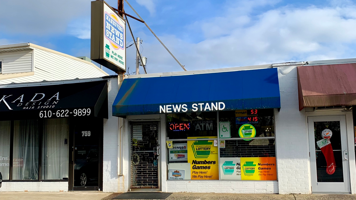
My name is Chris Plocinik, and I grew up in Springfield, Delco. In the late 1980s and early 1990s, while still in high school, I worked at a place called Maneuvers News Agency. Long before smartphones and social media, Maneuvers was where people went for their news — every newspaper and magazine imaginable — along with lottery tickets and a few everyday indulgences like tobacco and candy.
If you enjoyed reading, talking about the headlines, and meeting people from all walks of life, it was the perfect place to be.
Everyone Had a Name
The shop welcomed everyone — Wall Street professionals, shipyard workers, retirees, and locals just passing through. What made Maneuvers special wasn’t what it sold, but how it treated people. The owner, Dean Coletta, knew every customer by name. He talked with them, listened to them, and genuinely cared about their day.
I watched in amazement as Dean worked a crowd. Customers could have walked a few doors down to another store to buy lottery tickets with no line at all. Instead, they chose to wait. Not for the tickets — but for the conversation.
That’s when I learned a powerful lesson: people don’t just remember what you do for them; they remember how you make them feel.
Bringing That Lesson to Color Pop Paint Co.
Today, that same lesson guides everything we do at Color Pop Paint Co. Painting isn’t just about color, technique, or finishes — it’s about trust. When someone invites us into their home, it’s personal. That space holds memories, comfort, and the people who matter most.
Our job is to guide you through the process, answer your questions, and make the experience as smooth and stress-free as possible. We want to help transform your house into a warm, inviting space where your family can relax, connect, and create new memories.
More Than Just Paint
At the end of the day, we’re not just painting walls — we’re building relationships. We treat your home with care, respect your time, and communicate every step of the way.
Because when customers feel like family, the work means more.
And that’s the Color Pop Paint Co. way.
-Chris Plocinik
It’s 2026 Now Let’s Get to Work!
Happy New Year! Now Let’s Get to Work on Painting Your Dream
A brand-new year is here—and with it comes fresh goals, bold ideas, and the perfect opportunity for a clean slate. At Color Pop Paint Co., we want to wish you a very Happy New Year! May 2026 be filled with growth, confidence, and spaces that truly inspire you.
Now that the celebrations are over and the champagne glasses are back in the cabinet, it’s time to roll up our sleeves and get to work—on painting your dream.
New Year. New Vision. New Colors.
A new year is the perfect excuse to finally tackle those projects you’ve been thinking about:
That living room that needs warmth and personality
The office that should motivate you every morning
The exterior that deserves serious curb appeal
Paint has the power to transform not just your home, but how you feel in it. Color sets the tone for your day, your mood, and your mindset—and choosing the right one can make all the difference.
Dreams Don’t Paint Themselves
Big goals are great. Action is better. Whether your dream is bold accent walls, calming neutrals, or a full-home refresh, Color Pop Paint Co. is ready to help make it happen. We bring:
Professional craftsmanship
Thoughtful color guidance
Clean, efficient, stress-free service
You dream it—we paint it.
Make 2026 the Year of “Done”
This is the year projects move from “someday” to done. No more staring at chipped walls or outdated colors. No more putting it off. A few fresh coats of paint can completely change how your space looks and feels—and there’s no better time to start than now.
Let’s Get to Work
From all of us at Color Pop Paint Co., Happy New Year. When you’re ready to turn inspiration into reality, we’re ready with the brushes, rollers, and a whole lot of color.
Here’s to a bright, bold, beautifully painted 2026.
Let’s paint your dream.
Unconventional ideas—and a little psychology—can produce surprisingly powerful results
Unconventional ideas—and a little psychology—can produce surprisingly powerful results. As we head into 2026, challenge yourself to think differently in your business. Test small tweaks, experiment with new messages, and most importantly, track the results.
One simple but compelling example came from an unexpected place: a friendly bet between my ex-wife and me.
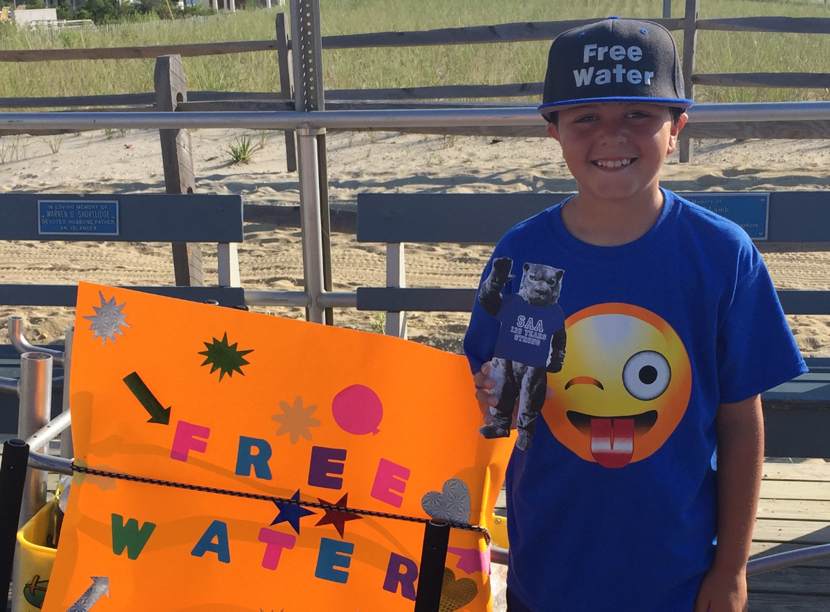
We were down the shore in Ocean City, New Jersey, when she suggested the kids set up a lemonade stand outside the beach house. I was skeptical. Standing out front selling lemonade didn’t seem very profitable—and making money should be fun. Somehow, that skepticism turned into a Saturday-morning wager: who could make the most money with the kids?
My idea was simple: Free Water.
We made a sign together that read “Free Water,” threw on a printed hat, and added one key monetization element—a clearly visible tip bucket. We set up early in the morning at one end of the Ocean City Boardwalk, right when people were biking, jogging, and exercising along the nostalgic two-mile wooden walkway.
Here’s where it became unconventional. I told the kids to give the water away freely—no questions, no pressure. I had picked up three 30-packs of bottled water from Costco (about six cents per bottle at the time), along with ice and coolers.
In less than two hours, we were sold out.
The kids made $176 in tips.
The reaction from people receiving free water was incredible—surprise, gratitude, and generosity. Needless to say, I won the bet, but more importantly, it became a fascinating real-world experiment in human nature.
The Free Water concept stuck. My son Chris would occasionally set up at one end of the boardwalk whenever he needed quick spending money. A close family friend, Palmer, took it to the next level—running the opposite end of the boardwalk and earning thousands in tips each summer like a true entrepreneurial strongman.
The lesson?
Sometimes giving first—and breaking the expected rules—can create results far beyond what conventional thinking ever would.
Chris Plocinik

Anything Is Possible: Painting Your Goals Into Reality for 2026
Anything Is Possible: Painting Your Goals Into Reality for 2026
A fresh year is a lot like a blank wall—full of potential, just waiting for the right color. As we look ahead to 2026, it’s the perfect moment to pause, dream big, and decide what you want the next chapter to look like. At Color Pop Paint Co., we believe goals aren’t just meant to be written down—they’re meant to be lived, layered, and brought to life.
Here’s how to set yourself up for success in 2026, one intentional brushstroke at a time.
Step 1: Start With a Vision (Pick Your Color Palette)
Before a single drop of paint hits the wall, there’s a vision. What do you want 2026 to feel like? Calm and balanced? Bold and adventurous? Productive and focused?
Take time to imagine your ideal year:
What does success look like for you personally?
Professionally?
In your home and daily routines?
Just like choosing a color palette, clarity comes first. When your vision is clear, every decision afterward becomes easier.
Step 2: Break Big Goals Into Paintable Sections
A whole room can feel overwhelming—until you tape it off. Big goals work the same way. Instead of tackling everything at once, break your goals into smaller, achievable steps.
For example:
Instead of “get healthier,” start with “move 3 times a week.”
Instead of “refresh my home,” begin with “paint one room I spend the most time in.”
Progress builds confidence, and confidence keeps you moving forward.
Step 3: Commit to Preparation (Because Prep Is Everything)
Any painter knows: the prep work matters just as much as the final coat. In life, preparation looks like setting routines, removing distractions, and making space for what matters.
Ask yourself:
What habits need to stay?
What needs to go?
What tools or support do I need to succeed?
Success in 2026 won’t come from perfection—it will come from consistency.
Step 4: Don’t Be Afraid of Bold Choices
Sometimes the color that scares you a little is the one that changes everything. Growth often lives just outside your comfort zone.
Say yes to new opportunities. Try something you’ve been putting off. Take that calculated risk. Whether it’s in your career, your creativity, or your home, bold choices often lead to the most rewarding results.
Step 6: Embrace the suck! You are gonna suck at something new when you start
Step 5: Celebrate Progress, Not Just the Finish Line
A beautifully painted space isn’t created in a single stroke—and neither is a successful year. Celebrate the small wins. Step back and admire how far you’ve come.
Every step forward counts.
Painting the Possibilities of 2026
As we head into a new year, remember this: anything is possible when you combine vision, intention, and action. Whether you’re transforming a room or transforming your life, 2026 is yours to create.
So grab the brush. Choose the colors that inspire you. And let’s make the year ahead bold, meaningful, and unmistakably you.
Carpe Diem from all of us at Color Pop Paint Co.—here’s to a vibrant, successful 2026.
-Chris Plocinik

Motorcyclist are out as Utah experiences a 60 degree Christmas-Eve…..
Friends, Family and Neighbors this Christmas please slow down and look for Motorcycles on the road!
Bikes are out - please slow down and be extra careful so everyone makes it home for Christmas.
In July of 2024 a car made a left turn in front of me, my bike was totalled and somehow I walked away with very minor injuries. It was a car making a left turn right on Mainstreet here in my hometown of Payson, UT.
Merry Christmas and God Bless,
Chris Plocinik
’Twas two nights before Christmas
’Twas two nights before Christmas, and all through the place,
Not a wall was left bare—every room needed grace.
The rollers were hung by the ladder with care,
In hopes that Color Pop soon would be there.
Then POP! went the colors—bold, merry, and bright,
Turning dull into wow overnight.
So this Christmas, don’t just deck the halls…
Color Pop Paint Co. makes your home pop—walls and all.
Merry Christmas from our family to yours
Chris and Cynthia Plocinik
Yellow in 2026?
What About Yellow? Is It on the Designer List for 2026?
When designers and trend forecasters look ahead to the color story of the next year, certain hues stand out as the ones to watch. For 2026, the broader design world is embracing a palette rich in nature-inspired tones, grounded neutrals, and thoughtfully expressive colors. But where does yellow fit into this picture?
The Short Answer: Yellow fits in — but with a twist
Yellow is still part of the 2026 conversation among designers — but it isn’t the loud, neon sunshine of trends past. Instead, experts see yellow evolving into more nuanced, grounded forms that pair beautifully with the earthy, restorative palette defining 2026. Homes and Gardens+1
Why Yellow Still Matters in 2026
Here’s how yellow is showing up on trend lists:
Uplifting & Nature-Inspired Yellows
Design forecasts for 2026 include uplifting yellows — from soft buttercream and buttermilk tones to parchment and ochre — that bring warmth without overwhelming a space. These shades often lean toward earthy or muted hues that complement nature-inspired palettes. Homes and Gardens+1
Soft, Grounded Alternatives Over Bright Brights
Rather than super-saturated primary yellow, designers are favoring:
Earthier ochres and caramel-leaning yellows
Buttery, creamy yellows that act like warm neutrals
These alternatives feel more sophisticated and easier to style in interiors. Homes and Gardens
Some Yellows Are Being Retired
Certain saturated yellows, especially mustard yellow in its boldest forms, are beginning to feel overdone and are being dialed back in favor of richer, more nuanced yellow variations. Yahoo Shopping
Designer Trends Around Yellow for 2026
Not the Pantone Color of the Year — 2026’s Pantone selection is a neutral white-leaning tone (Cloud Dancer), not yellow. Reddit
Paint brands’ palettes feature soft yellow tones — many 2026 forecasts by major paint companies (like Sherwin-Williams and Dunn-Edwards) include yellowish hues as accents or warm companions to core neutrals. The Nordroom
Yellow in interiors isn’t disappearing — it’s just shifting from bold statement walls to more gentle, luminosity-enhancing roles in kitchens, accent walls, and complementary palettes. House Beautiful
How to Use Yellow in 2026
If you want to bring yellow into your home next year, consider these tasteful applications:
Accent Walls & Architectural Features — Use a soft ochre or buttery yellow to highlight nooks, trim or alcoves.
Warm Neutrals — Pair with warm woods, creamy whites, and terracotta for grounded elegance.
Complementary Pairings — Yellows look stunning with rich teals, earthy greens, or deep plums — all strong 2026 color companions. Homes and Gardens
Final Take
Yes — yellow is still very much part of the designer conversation for 2026, but it’s taking on softer, more grounded forms rather than screaming brightness. This evolution reflects a broader design shift toward thoughtful, expressive spaces that feel warm, connected to nature, and emotionally uplifting. Expect yellow to be a friend in 2026 palettes — not the loudest voice in the room.
- Chris Plocinik
Bold Accent Walls: Because Beige Had a Long Run
Bold Accent Walls: Because Beige Had a Long Run
At Color Pop Paint Co, we love a good neutral… but sometimes a room just begs for a little drama. Enter the bold accent wall: the design move that says, “Yes, I have opinions—and they’re colorful.”
If your space feels fine but forgettable, a bold accent wall might be the easiest way to take it from meh to wow.
Why Bold Accent Walls Work
Bold accent walls do one big thing really well: they create focus. Whether it’s behind a bed, anchoring a sofa, or spotlighting a fireplace, a strong color draws the eye and gives your room an instant personality boost—without committing to painting every wall.
Think of it as a statement jacket for your room. The rest of the outfit can stay simple.
Popular Bold Choices Right Now
We’re seeing homeowners move beyond the usual navy-and-charcoal combo and embrace colors with confidence:
Moody greens for grounded, cozy vibes
Deep blues that feel dramatic but timeless
Terracotta and clay tones that warm up modern spaces
Rich plums and wine hues for instant sophistication
True black (yes, black!) for ultra-modern contrast
Bold doesn’t mean chaotic—it means intentional.
Where Accent Walls Shine
Not every wall wants the spotlight. Here are a few places where bold accent walls really pop:
Living rooms: Frame the main gathering space
Bedrooms: Create a headboard effect without buying one
Dining rooms: Add intimacy and conversation energy
Home offices: Boost creativity and focus
Entryways: Make a memorable first impression
Pro tip: If it’s the first wall you notice when you walk in, you’re on the right track.
Finish Matters More Than You Think
Color isn’t the only decision—finish plays a big role in the final look.
Matte: Soft, modern, and moody
Eggshell or satin: Slight sheen, easy to clean
High-gloss: Bold, reflective, and seriously dramatic
A high-gloss accent wall in a deep color? That’s not paint—that’s a conversation starter.
How to Keep It From Feeling Overwhelming
Bold doesn’t mean busy. Balance your accent wall with:
Lighter or neutral walls around it
Simple furniture lines
Textures like wood, linen, or metal
Let the wall do the talking.
=
Ready to Go Bold?
At Color Pop Paint Co, we believe your walls should have personality—just like you. A bold accent wall is one of the easiest ways to transform a space, show confidence, and have a little fun with color.
Because life’s too short for boring walls.
- Chris Plocinik
2026 Ceiling & Paint Finish Trends: What’s Hot This Year
2026 Ceiling & Paint Finish Trends: What’s Hot This Year
At Color Pop Paint Co., we’re always watching what’s next — especially when it comes to ceilings and finishes, two areas that are rapidly evolving from “afterthought” to design showpiece. In 2026, interior paint isn’t just about wall color — it’s about creating immersive spaces with bold personalities, refined textures, and thoughtful finishes. Here’s what’s trending now:
1. Ceilings as a “Fifth Wall”
One of the biggest shifts this year is treating the ceiling like any other design surface. Gone are the days of flat white plaster as default — in 2026, ceilings are:
Colored boldly — choosing hues that either match or complement the walls for seamless drama. amykranecolor.com
Part of tonal layering techniques — like color capping, where a gradient of related shades (light–medium–dark) carries from walls through trim and up to the ceiling, creating depth and cohesion. ELLE Decor+1
No longer hidden backgrounds but key parts of the palette that can heighten mood and make rooms feel intentional and finished. movewithjhg.com
Whether you pick a subtle tint to visually raise a low ceiling or a saturated color to make an intimate statement, 2026 is all about bringing ceilings into the color conversation. amykranecolor.com
2. Rich, Earth-Connected Colors
Color continues to be driven by nature and grounding palettes. Leading paint pros highlight:
Warm, earthy tones like olive, ochre, moss, and deep browns that pair beautifully with natural materials. racreativedesigns.in+1
Greens — from forest to sage — remain big in both walls and ceilings, accentuating calmness and connection to the outdoors. Boston Paint & Power
These tones work especially well as ceiling colors in rooms that aim for warmth without feeling saturated or busy. NewHomeSource
Expect to see ceilings painted in complex hues that speak to comfort and nature rather than stark neutrals. racreativedesigns.in
3. Finish Matters: More Texture & Sheen Variety
2026 brings an expanded finish vocabulary. It’s not just what color you choose — it’s how it looks:
Matte & Mineral Finishes
Still go-to for living rooms and bedrooms because they feel soft, luxurious, and hide imperfections. Boston Paint & Power
Satin & Eggshell
Ideal for kitchens, bathrooms, and high-traffic areas — durable with a gentle sheen. Boston Paint & Power
High Gloss Ceilings
Yes, glossy ceilings are back — bouncing light and visually lifting spaces when applied to dark, rich colors. Willem Hendrik Design
Textured Finishes
From plaster and limewash walls to subtle roughness on ceilings, texture adds character and depth that flat paint can’t match. Boston Paint & Power
Mixing finishes across the same room — e.g., matte walls with satin trim and a glossy ceiling — is part of the sophisticated layering trend designers love this year. Willem Hendrik Design
4. Color Drenching & Monochrome Moments
Another extension of ceiling trends is color drenching — painting walls, trim, and ceilings in the same hue for a cocoon-like result. Designers are evolving this idea by blending textures and finishes to keep monochrome spaces from ever feeling flat. movewithjhg.com
This approach works beautifully in spaces where you want tranquility or drama without distraction — perfect for bedrooms, libraries, or intimate living rooms.
Final Take: Bold Ceilings, Rich Finishes, and Intention
In 2026, interior paint trends are moving toward immersive design. Ceilings are evolving from blank canvases to expressive surfaces. Color isn’t just an accent — it’s an emotional and spatial tool.
Whether you choose earthy neutrals that calm the mind or deep saturated hues that elevate a room’s mood, now is the time to think about paint color and finish as architecture — not just decoration.
Ready to try these trends yourself?
Call or Text Color Pop Paint Co. 801-709-5238 for personalized color consultations, the newest finish technologies, and expert tips on how to bring 2026 trends to your home.
-Chris Plocinik
Green vs. Blue: The Ultimate Wall Color Death Match
Green vs. Blue: The Ultimate Wall Color Death Match
By Color Pop Paint Co.
Ladies and gentlemen, homeowners and DIY warriors, welcome to the most dramatic showdown since “matte vs. eggshell.” In the left corner, wearing a leafy crown and smelling faintly of fresh-cut grass, we have GREEN.
In the right corner, cool, calm, and pretending not to care, it’s BLUE.
This is not just paint. This is a death match for wall supremacy.
Round One: First Impressions
Green kicks things off by yelling, “I’M NATURE.” Forests. Avocados. Money. That one plant you forgot to water but somehow survived. Green claims it brings balance, harmony, and the vague sense that you’ve got your life together.
Blue responds by not responding – dodging and weaving the onslaught from Green. Blue just exists—like the ocean, the sky, and your favorite pair of jeans. Blue whispers, “Relax,” while Green is over there doing yoga and aggressively breathing.
Score so far:
Green: Energetic, earthy, slightly smug
Blue: Chill, timeless, emotionally unavailable
Round Two: The Room Test
Put Green in a room and suddenly it’s a botanical retreat. Even if the room contains zero plants and one sad folding chair, Green says, “This is intentional.”
Put Blue in a room and now it’s a coastal getaway. No coast nearby? No problem. Blue doesn’t care about geography. Blue is the vibe.
Green says: “You should host brunch.”
Blue says: “You should take a nap.”
Round Three: Personality Clash
Green is the friend who owns crystals and insists you “touch the wall and feel the energy.”
Blue is the friend who owns a really nice couch and insists you “sit down and stop stressing.”
Green thrives in kitchens, offices, and anywhere productivity is expected.
Blue dominates bedrooms, bathrooms, and those rooms where nothing happens except scrolling on your phone.
Final Verdict (Because Walls Deserve Peace)
After several rounds of intense color combat, we’ve reached the only reasonable conclusion:
There is no loser.
Only beautifully painted walls.
Green brings life, growth, and “I have plants now.”
Blue brings calm, depth, and “everything is fine.”
And at Color Pop Paint Co., we’re Switzerland in this color war—neutral, supportive, and fully stocked with both contenders. Whether you choose Team Green, Team Blue, or start a truce with both, your walls are about to win big.
Now excuse us while we referee the next match: White vs. “Not Quite White.”
- Chris Plocinik
2026 Interior Paint and Wall Covering Trends: What to Expect from Color Pop Paint Co.
2026 Interior Paint and Wall Covering Trends: What to Expect from Color Pop Paint Co.
As we step into 2026, the world of interior design is set to embrace bold colors, innovative materials, and sustainable options that reflect individual style and well-being. At Color Pop Paint Co, we’re excited to share the anticipated trends for interior paint and wall coverings that are sure to transform homes and commercial spaces alike.
1. Earthy Tones and Nature-Inspired Palettes
While past trends have leaned towards the minimalist whites and greys, 2026 is making a significant shift towards warmer, earthy tones. Expect to see shades of terracotta, olive green, and muted ochre dominating the scene. These colors bring a sense of tranquility and connection to the outdoors, encouraging a more grounded lifestyle. Earthy palettes can be used effectively in bedrooms, living rooms, and kitchens to create inviting and cozy spaces.
2. Bold Accent Walls
Accent walls are making a vibrant comeback. In 2026, homeowners will embrace striking colors and patterns that define a space. Expect to see deep blues, emerald greens, or even dramatic black with intricate wall coverings. Textured wallpaper featuring geometric designs or florals will be popular choices for these feature walls, adding dimension and personality to any room.
3. Sustainable and Eco-Friendly Materials
As awareness of environmental issues grows, so does the demand for sustainable materials in interior design. Look for paints that are low in volatile organic compounds (VOCs) and wall coverings made from recycled materials. Natural fibers like hemp and organic cotton will be prevalent in wall textiles, bringing sustainability into homes without sacrificing style.
4. Textured Finishes
In 2026, texture will play a crucial role in design. From stucco and plaster-like finishes to more modern 3D wallpaper options, adding texture to walls can create visual interest and depth. Color Pop Paint Co encourages the use of textured paint finishes that allow light to interact dynamically with surfaces, making any space feel more engaging and inviting.
5. Customized Color Mixing
Personalization continues to trend, and 2026 will see a rise in custom color mixing options. Homeowners are increasingly looking for unique hues that reflect their personality and style. Color Pop Paint Co offers a bespoke service where customers can collaborate with color specialists to develop their own shades, ensuring a truly personalized palette for their interiors.
6. Digital and Smart Paints
Innovations in technology are paving the way for new paint options. In 2026, we can expect to see more digital and smart paints that can change colors or patterns with just a touch of a button or through smartphone applications. This technology not only enhances aesthetics but also allows for adaptability as personal tastes and trends evolve.
Conclusion
The interior painting and wall covering trends of 2026 reflect a deeper connection to our environment, personal expression, and advancements in technology. At Color Pop Paint Co, we are dedicated to staying ahead of these trends and providing our clients with high-quality, innovative options that turn their spaces into havens of beauty and functionality. Whether you’re planning a refreshing renovation or a complete overhaul, keep these trends in mind to create interiors that inspire and delight!
Stay tuned to our blog for more insights and tips on how to make the most out of your painting and decorating projects in the upcoming year!
Happy Hanukkah and Shalom,
Chris Plocinik
Happy Hanukkah from Color Pop Paint Co.
Happy Hanukkah from Color Pop Paint Co.
As the days grow shorter and the nights glow a little brighter, all of us at Color Pop Paint Co. would like to take a moment to wish our Jewish friends, neighbors, partners, and customers a very Happy Hanukkah.
Hanukkah, the Festival of Lights, is a beautiful celebration of hope, resilience, and the power of light to shine through even the darkest moments. Each candle lit on the menorah tells a story of perseverance, faith, and community—values that deeply resonate with us here at Color Pop Paint Co.
Color has always been at the heart of what we do. From bold, joyful hues to soft, comforting tones, paint has the power to transform spaces and uplift spirits. Hanukkah reminds us that even a small flame can make a meaningful difference, just as a single pop of color can completely change the feeling of a room. It’s a season that celebrates warmth, togetherness, and tradition—things we believe should be reflected not only in our homes, but in how we treat one another.
During this special time, families gather to light candles, share stories, enjoy traditional foods, and create lasting memories. We’re honored to be a small part of the spaces where those memories are made, whether it’s a cozy living room, a lively kitchen, or a freshly painted home ready to welcome loved ones.
To our Jewish community: thank you for the light you bring to our world and to our shared communities. May this Hanukkah be filled with peace, joy, meaningful moments, and beautiful color—both in your homes and in your hearts.
From all of us at Color Pop Paint Co., we wish you a bright and joyful Hanukkah.
Happy Hanukkah and Shalom.
- Chris Plocinik
Feeling Blue? Embrace the Color That Makes You Smile!
Feeling Blue? Embrace the Color That Makes You Smile!
Hey there, paint aficionados and color connoisseurs! Today, we’re diving into the cheerful depths of the color blue—a shade that’s more than just a color; it’s a lifestyle! At Color Pop Paint Co, we believe that blue is not only the color of the ocean and the sky but also the perfect hue to brighten any room (and mood). So, grab your brushes, and let’s dive into the fun world of blue!
Blue-tiful Beginnings
Let’s kick things off with some blue-tiful facts! Did you know that blue is often associated with calmness, trust, and creativity? That’s right! So, if you want to be as chill as a beach day or as trustworthy as your dog’s eye contact, it’s time to add some blue to your palette!
Shades of Blue: More Than Meets the Eye
When it comes to blue, we don’t just stop at “blue.” Oh no, folks! There are so many shades to choose from that we might just need a whole weekend to discuss them all (but let’s save that for our next post). Here’s a sneak peek:
Sky Blue: For when you want a room that feels like a fresh breeze on a summer day.
Navy Blue: The perfect shade for those who want their space to feel sophisticated… or a bit piratey. Arrr!
Baby Blue: Ideal for nurseries and anyone who loves cuddling with teddy bears and pastel dreams.
The Blue Mood
Feeling “blue” can mean different things. It could be sad, or it could just mean you forgot to water your cactus (sorry, little guy). But when it comes to paint, blue is here to turn that frown upside down! Create a workspace painted in bright blue, and suddenly your to-do list feels less overwhelming and more like a fun game. Just don't be surprised if your productivity comes with a side of dancing!
Decorating with Blue: The Dos and Don’ts
Now that you’re ready to go blue, remember these important decorating tips:
Do mix blue with warm colors like yellow or orange for a cheerful vibe.
Don’t paint your bathroom navy blue unless you’re ready to embrace your inner submarine captain.
Do use lighter blues to open up small spaces and create the illusion of airiness.
Don’t forget to accessorize! A blue sofa, chairs, or artwork can create a cohesive and stylish look!
Fun Blue Projects
Want to jazz up your space? Here are a couple of DIY projects to make your surroundings blue-tiful:
Painted Flower Pots: Turn those plain pots into stunning blue masterpieces! Paint them a solid blue or create a fun pattern—it’s the perfect way to bring a little life indoors.
Blue Accent Wall: Choose a bold blue and make one wall stand out! Add a gallery of colorful art, and you’ll have a dreamy focal point that will make you feel inspired daily.
Final Thoughts
So, whether you’re feeling a little blue or completely in the zone, remember that blue is more than just a color—it’s a way to express yourself and transform your environment. So, roll up your sleeves, grab your brushes, and let your creativity flow like the waves of the ocean!
At Color Pop Paint Co, we’re here to help you find your perfect shade of blue. Don’t just paint—create a masterpiece!
Until next time, stay colorful, friends!
Chris Plocinik